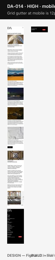
Grid gutter at mobile is 12px, design specifies 8px
"Main (M)" defines a 8px gutter and a 8px outer margin at mobile. 25 multi-column containers render a 12px gutter instead, and only 1 use the specified 8px.
Design
| grid | Main (M) |
|---|
| pattern | COLUMNS |
|---|
| count | 6 |
|---|
| gutterSize | 8 |
|---|
| offset | 8 |
|---|
| sectionSize | 57.67 |
|---|
| alignment | STRETCH |
|---|
Build
| breakpoint | mobile |
|---|
| dominant | 12 |
|---|
| dominantUses | 25 |
|---|
 high
DA-005
spacing-offscale
desktopmobiletablet
high
DA-005
spacing-offscale
desktopmobiletablet
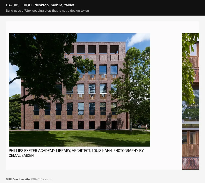
Build uses a 72px spacing step that is not a design token
150 gap/padding declarations resolve to 72px. The design's spacing scale is 4, 8, 12, 16, 20, 24, 28, 34, 40, 44, 60, 80, 120, 148, 150px.
 high
DA-002
type-detail
mobile
high
DA-002
type-detail
mobile
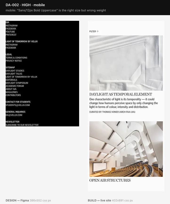
mobile: "Sans/12px Bold Uppercase" is the right size but wrong weight
At mobile, 12px matches, but: weight 700 → 400. The design uses this style on 227 layers at this breakpoint.
Design
| style | Sans/12px Bold Uppercase |
|---|
| family | VeluxGothic |
|---|
| fontSize | 12 |
|---|
| fontWeight | 700 |
|---|
| lineHeight | 16 |
|---|
| lineHeightRatio | 1.33 |
|---|
| letterSpacing | -0.24 |
|---|
| case | UPPER |
|---|
| uses | 227 |
|---|
Build
| family | sans |
|---|
| fontSize | 12 |
|---|
| fontWeight | 400 |
|---|
| lineHeight | 16 |
|---|
| lineHeightRatio | 1.33 |
|---|
| letterSpacing | -0.24 |
|---|
| case | uppercase |
|---|
| uses | 13 |
|---|
| pages | 4 |
|---|
 high
DA-003
type-prominence
mobile
high
DA-003
type-prominence
mobile
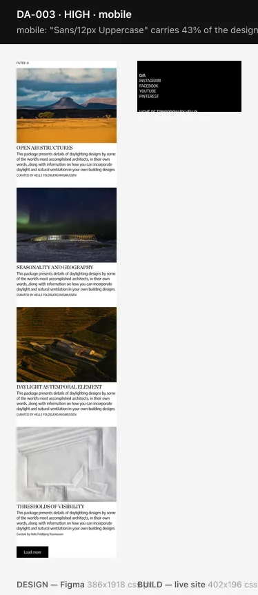
mobile: "Sans/12px Uppercase" carries 43% of the design's text but 1% of the build's
At mobile the design applies Sans/12px Uppercase to 673 of 1561 text layers. The build renders that style on only 12 of 1101 elements. The dominant sans uppercase style at mobile is 16px (395 elements) — the responsive step to 12px looks unimplemented.
Design
| style | Sans/12px Uppercase |
|---|
| family | VeluxGothic |
|---|
| fontSize | 12 |
|---|
| fontWeight | 400 |
|---|
| lineHeight | 16 |
|---|
| lineHeightRatio | 1.33 |
|---|
| letterSpacing | -0.24 |
|---|
| case | UPPER |
|---|
| uses | 677 |
|---|
| usesAtBreakpoint | 673 |
|---|
| share | 0.43 |
|---|
Build
| family | sans |
|---|
| fontSize | 16 |
|---|
| fontWeight | 400 |
|---|
| lineHeight | 20 |
|---|
| lineHeightRatio | 1.25 |
|---|
| letterSpacing | -0.32 |
|---|
| case | uppercase |
|---|
| uses | 1404 |
|---|
| pages | 57 |
|---|
 medium
DA-015
grid
mobile
medium
DA-015
grid
mobile
No 6-column grid renders at mobile, but "Main (M)" defines one
The design's Main (M) grid is 6 columns, 8px gutter, 8px margin. The build renders 1, 12, 2-column grids at this breakpoint.
Design
| grid | Main (M) |
|---|
| pattern | COLUMNS |
|---|
| count | 6 |
|---|
| gutterSize | 8 |
|---|
| offset | 8 |
|---|
| sectionSize | 57.67 |
|---|
| alignment | STRETCH |
|---|
 medium
DA-001
type-detail
tablet
medium
DA-001
type-detail
tablet
tablet: "Serif/56px" is the right size but wrong line-height
At tablet, 56px matches, but: line-height 64px (1.14) → 48px (0.86). The design uses this style on 43 layers at this breakpoint.
Design
| style | Serif/56px |
|---|
| family | Chronicle Deck |
|---|
| fontSize | 56 |
|---|
| fontWeight | 400 |
|---|
| lineHeight | 64 |
|---|
| lineHeightRatio | 1.14 |
|---|
| letterSpacing | -2.8 |
|---|
| case | UPPER |
|---|
| uses | 43 |
|---|
Build
| family | serif |
|---|
| fontSize | 56 |
|---|
| fontWeight | 400 |
|---|
| lineHeight | 48 |
|---|
| lineHeightRatio | 0.86 |
|---|
| letterSpacing | -2.8 |
|---|
| case | uppercase |
|---|
| uses | 36 |
|---|
| pages | 10 |
|---|
 medium
DA-004
type-prominence
mobile
medium
DA-004
type-prominence
mobile
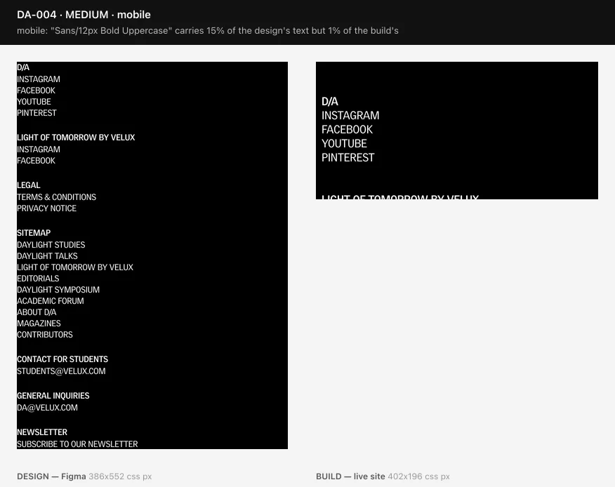
mobile: "Sans/12px Bold Uppercase" carries 15% of the design's text but 1% of the build's
At mobile the design applies Sans/12px Bold Uppercase to 227 of 1561 text layers. The build renders that style on only 12 of 1101 elements. The dominant sans uppercase style at mobile is 16px (395 elements) — the responsive step to 12px looks unimplemented.
Design
| style | Sans/12px Bold Uppercase |
|---|
| family | VeluxGothic |
|---|
| fontSize | 12 |
|---|
| fontWeight | 700 |
|---|
| lineHeight | 16 |
|---|
| lineHeightRatio | 1.33 |
|---|
| letterSpacing | -0.24 |
|---|
| case | UPPER |
|---|
| uses | 227 |
|---|
| usesAtBreakpoint | 227 |
|---|
| share | 0.15 |
|---|
Build
| family | sans |
|---|
| fontSize | 16 |
|---|
| fontWeight | 400 |
|---|
| lineHeight | 20 |
|---|
| lineHeightRatio | 1.25 |
|---|
| letterSpacing | -0.32 |
|---|
| case | uppercase |
|---|
| uses | 1404 |
|---|
| pages | 57 |
|---|
 low
DA-019
design-debt
desktoptablet
low
DA-019
design-debt
desktoptablet
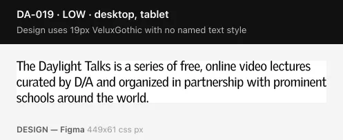
Design uses 19px VeluxGothic with no named text style
108 layers (e.g. "The Daylight Talks is a series of free, ") sit outside the type scale. This is a gap in the design system, not a build defect.
Design
| family | VeluxGothic |
|---|
| fontSize | 19 |
|---|
| fontWeight | 400 |
|---|
| lineHeight | 23 |
|---|
| lineHeightRatio | 1.21 |
|---|
| letterSpacing | -0.38 |
|---|
| case | ORIGINAL |
|---|
| sample | The Daylight Talks is a series of free, |
|---|
| uses | 108 |
|---|
 low
DA-020
design-debt
desktop
low
DA-020
design-debt
desktop
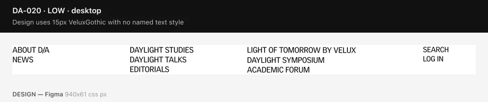
Design uses 15px VeluxGothic with no named text style
106 layers (e.g. "search") sit outside the type scale. This is a gap in the design system, not a build defect.
Design
| family | VeluxGothic |
|---|
| fontSize | 15 |
|---|
| fontWeight | 400 |
|---|
| lineHeight | 19 |
|---|
| lineHeightRatio | 1.27 |
|---|
| letterSpacing | -0.3 |
|---|
| case | UPPER |
|---|
| sample | search |
|---|
| uses | 106 |
|---|
 low
DA-021
design-debt
tablet
low
DA-021
design-debt
tablet
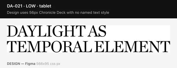
Design uses 56px Chronicle Deck with no named text style
5 layers (e.g. "DAYLIGHT AS
TEMPORAL ELEMENT ") sit outside the type scale. This is a gap in the design system, not a build defect.
Design
| family | Chronicle Deck |
|---|
| fontSize | 56 |
|---|
| fontWeight | 400 |
|---|
| lineHeight | 54 |
|---|
| lineHeightRatio | 0.96 |
|---|
| letterSpacing | -2.24 |
|---|
| case | UPPER |
|---|
| sample | DAYLIGHT AS
TEMPORAL ELEMENT |
|---|
| uses | 5 |
|---|
 low
DA-022
design-debt
tablet
low
DA-022
design-debt
tablet
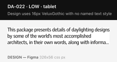
Design uses 16px VeluxGothic with no named text style
4 layers (e.g. "This package presents details of dayligh") sit outside the type scale. This is a gap in the design system, not a build defect.
Design
| family | VeluxGothic |
|---|
| fontSize | 16 |
|---|
| fontWeight | 400 |
|---|
| lineHeight | 20 |
|---|
| lineHeightRatio | 1.25 |
|---|
| letterSpacing | -0.32 |
|---|
| case | ORIGINAL |
|---|
| sample | This package presents details of dayligh |
|---|
| uses | 4 |
|---|
 low
DA-023
design-debt
mobile
low
DA-023
design-debt
mobile
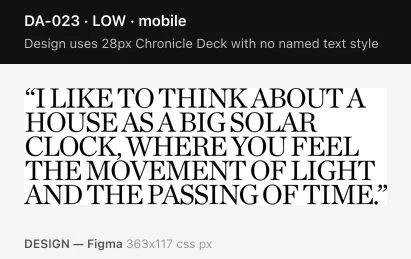
Design uses 28px Chronicle Deck with no named text style
3 layers (e.g. "“I LIKE TO THINK ABOUT A HOUSE AS A BIG ") sit outside the type scale. This is a gap in the design system, not a build defect.
Design
| family | Chronicle Deck |
|---|
| fontSize | 28 |
|---|
| fontWeight | 400 |
|---|
| lineHeight | 24 |
|---|
| lineHeightRatio | 0.86 |
|---|
| letterSpacing | -1.12 |
|---|
| case | UPPER |
|---|
| sample | “I LIKE TO THINK ABOUT A HOUSE AS A BIG |
|---|
| uses | 3 |
|---|
 low
DA-024
design-debt
desktop
low
DA-024
design-debt
desktop
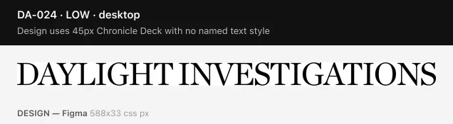
Design uses 45px Chronicle Deck with no named text style
1 layers (e.g. "Daylight investigations") sit outside the type scale. This is a gap in the design system, not a build defect.
Design
| family | Chronicle Deck |
|---|
| fontSize | 45 |
|---|
| fontWeight | 400 |
|---|
| lineHeight | 39 |
|---|
| lineHeightRatio | 0.87 |
|---|
| letterSpacing | -1.8 |
|---|
| case | UPPER |
|---|
| sample | Daylight investigations |
|---|
| uses | 1 |
|---|
 low
DA-025
design-debt
tablet
low
DA-025
design-debt
tablet
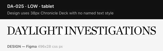
Design uses 38px Chronicle Deck with no named text style
1 layers (e.g. "Daylight investigations") sit outside the type scale. This is a gap in the design system, not a build defect.
Design
| family | Chronicle Deck |
|---|
| fontSize | 38 |
|---|
| fontWeight | 400 |
|---|
| lineHeight | 32 |
|---|
| lineHeightRatio | 0.84 |
|---|
| letterSpacing | -1.52 |
|---|
| case | UPPER |
|---|
| sample | Daylight investigations |
|---|
| uses | 1 |
|---|
 low
DA-026
design-debt
desktop
low
DA-026
design-debt
desktop
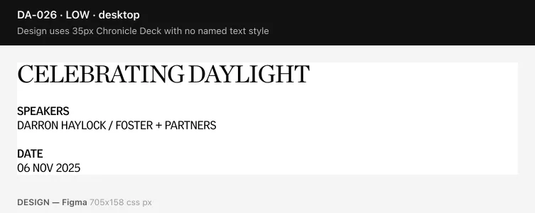
Design uses 35px Chronicle Deck with no named text style
1 layers (e.g. "celebrating daylight") sit outside the type scale. This is a gap in the design system, not a build defect.
Design
| family | Chronicle Deck |
|---|
| fontSize | 35 |
|---|
| fontWeight | 400 |
|---|
| lineHeight | 30 |
|---|
| lineHeightRatio | 0.86 |
|---|
| letterSpacing | -1.4 |
|---|
| case | UPPER |
|---|
| sample | celebrating daylight |
|---|
| uses | 1 |
|---|
Design corner radius 24px never renders in the build
Applied to 4 design layers. The build only renders fully-rounded (pill) corners.
No evidence image — this finding has no single element to frame.
low
DA-006
spacing-offscale
mobile
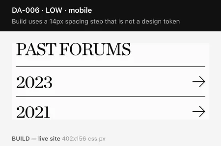
Build uses a 14px spacing step that is not a design token
52 gap/padding declarations resolve to 14px. The design's spacing scale is 4, 8, 12, 16, 20, 24, 28, 34, 40, 44, 60, 80, 120, 148, 150px.
 low
DA-007
spacing-offscale
mobile
low
DA-007
spacing-offscale
mobile
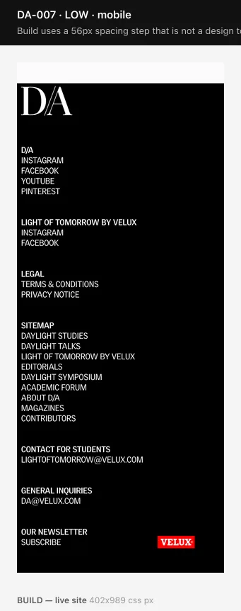
Build uses a 56px spacing step that is not a design token
38 gap/padding declarations resolve to 56px. The design's spacing scale is 4, 8, 12, 16, 20, 24, 28, 34, 40, 44, 60, 80, 120, 148, 150px.
 low
DA-008
spacing-offscale
desktoptablet
low
DA-008
spacing-offscale
desktoptablet
Build uses a 250px spacing step that is not a design token
38 gap/padding declarations resolve to 250px. The design's spacing scale is 4, 8, 12, 16, 20, 24, 28, 34, 40, 44, 60, 80, 120, 148, 150px.
 low
DA-009
spacing-offscale
desktop
low
DA-009
spacing-offscale
desktop
Build uses a 17.83px spacing step that is not a design token
36 gap/padding declarations resolve to 17.83px. The design's spacing scale is 4, 8, 12, 16, 20, 24, 28, 34, 40, 44, 60, 80, 120, 148, 150px.
 low
DA-010
spacing-offscale
desktopmobiletablet
low
DA-010
spacing-offscale
desktopmobiletablet
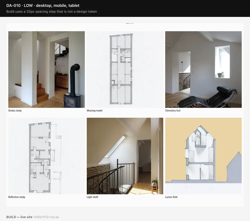
Build uses a 32px spacing step that is not a design token
19 gap/padding declarations resolve to 32px. The design's spacing scale is 4, 8, 12, 16, 20, 24, 28, 34, 40, 44, 60, 80, 120, 148, 150px.
 low
DA-011
spacing-offscale
mobile
low
DA-011
spacing-offscale
mobile
Build uses a 158px spacing step that is not a design token
19 gap/padding declarations resolve to 158px. The design's spacing scale is 4, 8, 12, 16, 20, 24, 28, 34, 40, 44, 60, 80, 120, 148, 150px.
 low
DA-012
spacing-offscale
tablet
low
DA-012
spacing-offscale
tablet
Build uses a 196px spacing step that is not a design token
19 gap/padding declarations resolve to 196px. The design's spacing scale is 4, 8, 12, 16, 20, 24, 28, 34, 40, 44, 60, 80, 120, 148, 150px.
 low
DA-013
spacing-offscale
desktoptablet
low
DA-013
spacing-offscale
desktoptablet
Build uses a 50px spacing step that is not a design token
10 gap/padding declarations resolve to 50px. The design's spacing scale is 4, 8, 12, 16, 20, 24, 28, 34, 40, 44, 60, 80, 120, 148, 150px.
 triage
DA-017
aspect-ratio
desktoptabletmobile
triage
DA-017
aspect-ratio
desktoptabletmobile
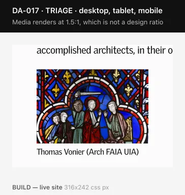
Media renders at 1.5:1, which is not a design ratio
21 media elements across 9 template/breakpoint combinations render at 1.5:1; the design uses 1, 1.78, 0.75, 1.33, 0.8. NOT auto-filed — the harvest cannot distinguish a design media slot from a logo or icon's intrinsic ratio, so this needs visual confirmation.
 triage
DA-018
aspect-ratio
desktoptabletmobile
triage
DA-018
aspect-ratio
desktoptabletmobile
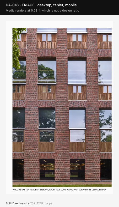
Media renders at 0.63:1, which is not a design ratio
8 media elements across 3 template/breakpoint combinations render at 0.63:1; the design uses 1, 1.78, 0.75, 1.33, 0.8. NOT auto-filed — the harvest cannot distinguish a design media slot from a logo or icon's intrinsic ratio, so this needs visual confirmation.
No findings match these filters.
Method and limits
What is checked deterministically: type scale (size, weight, line-height ratio, tracking), spacing steps, grid columns and gutters, corner radii, and how much of each breakpoint's text a given style carries on both sides. These are content-invariant.
What is held for triage: media aspect ratios. The harvest cannot tell a design media slot from a logo's intrinsic ratio, so these are shown but never auto-filed.
Known limit: the per-breakpoint design vocabulary is only as complete as what was drawn. A template drawn at desktop but not tablet makes its styles look desktop-exclusive, which can turn some type-offscale findings at tablet into false positives. The high-severity findings do not depend on that inference.
Not covered: overlay states — navigation, search modal, newsletter subscription, daylight talks reminder — have no crawlable URL and are absent from both the capture pipeline and this audit.